Case study 01 · DUBAI POLICE
A government platform for 3.5M+ residents - split into two experiences under one domain.
- ROLE
- Senior UX/UI Designer
- CLIENT
- Dubai Police GHQ
- TIMELINE
- 6–8 Months
- LIVE AT
- dubaipolice.gov.ae ↗

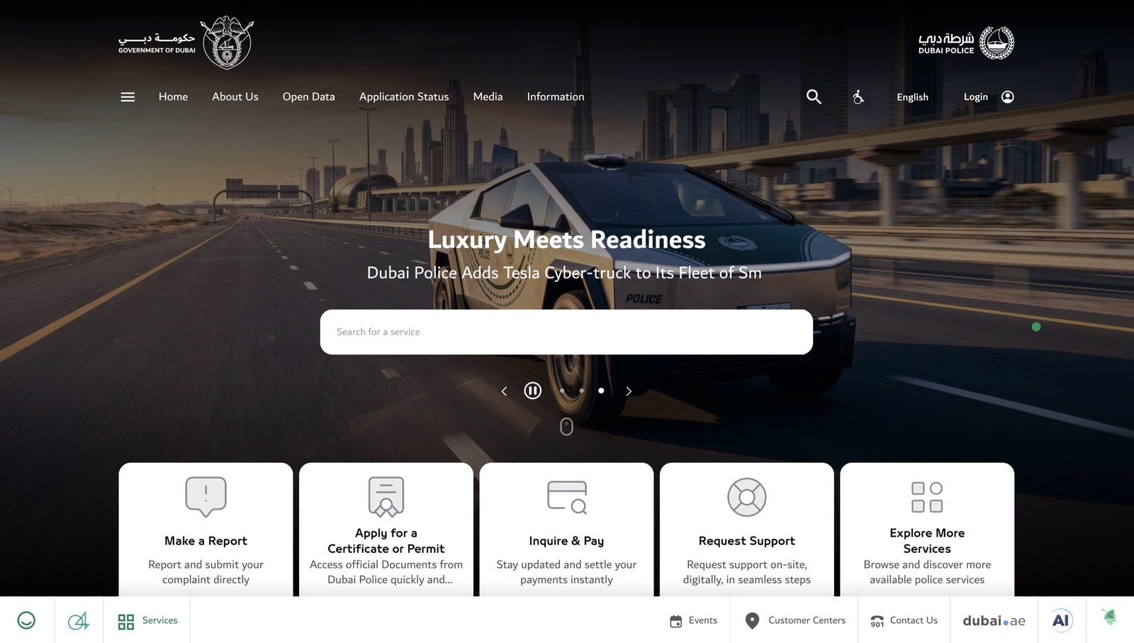
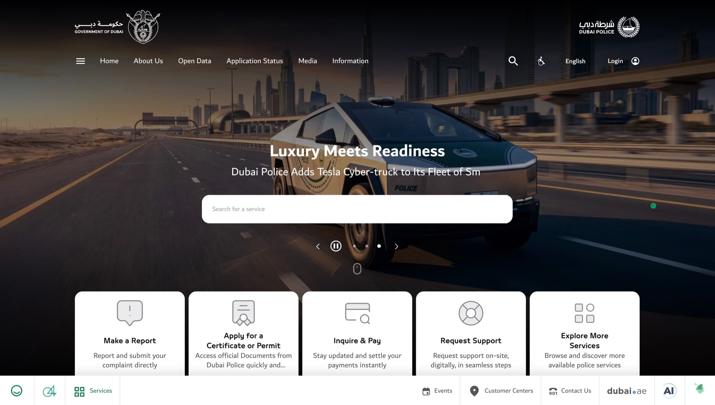
Dubai Police website homepage - service search and five primary service tiles
01
The briefModernise a government platform that was forcing information and services through one fractured navigation.
02
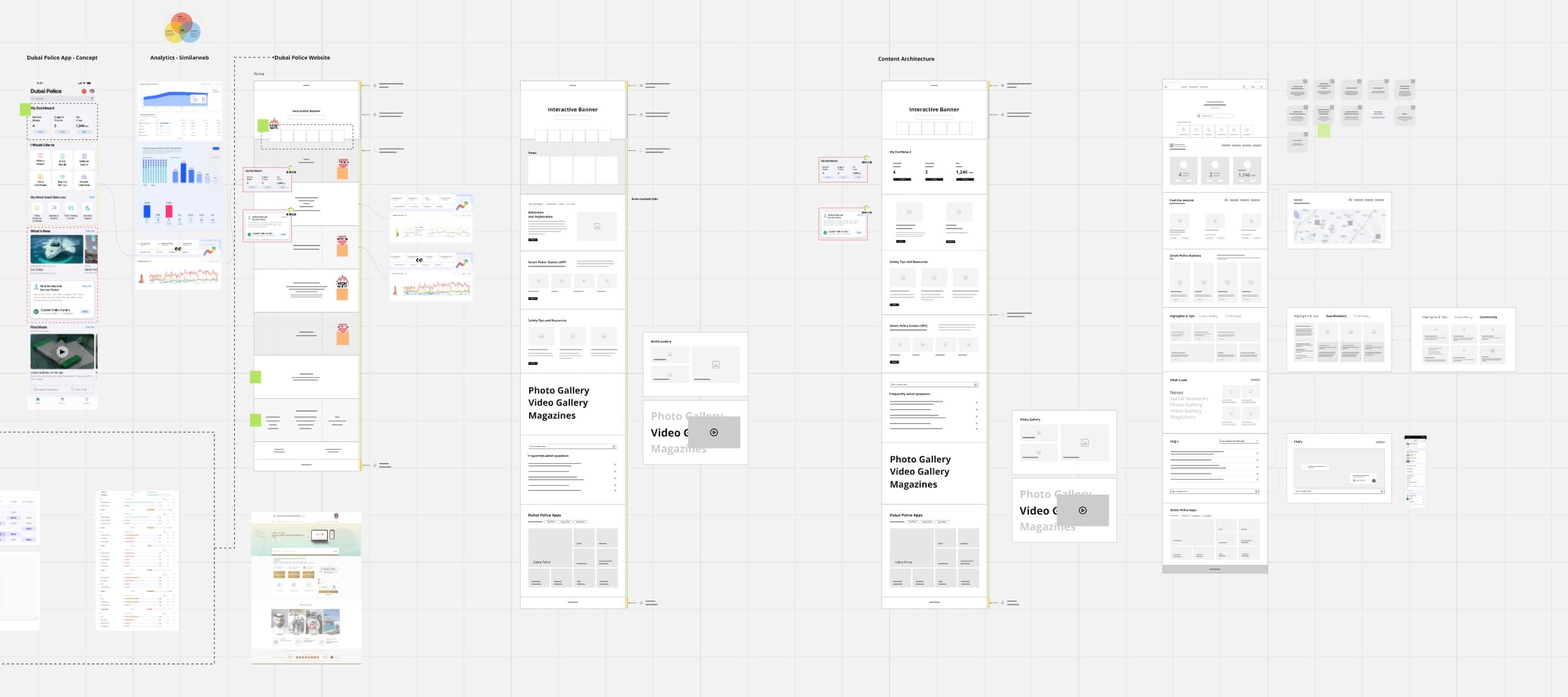
The researchFour research streams.One defensible direction.
- 01
Analytics Audit
6 months · 12 metrics
- 02
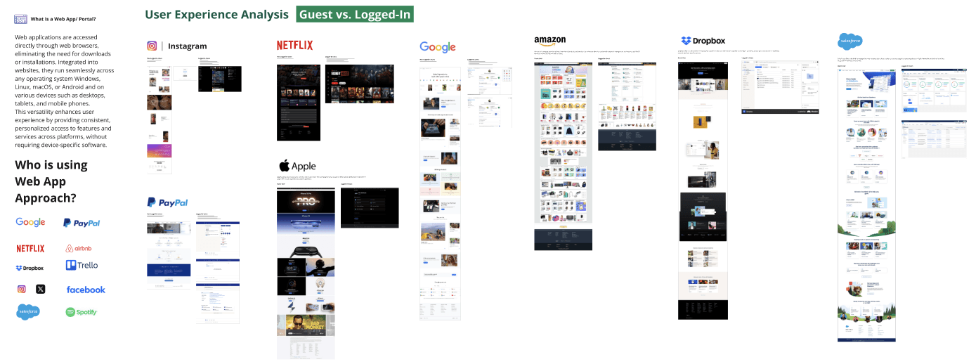
Global Benchmark
8 portals · 12-criteria
- 03
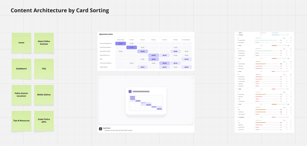
Card Sorting
21 participants · hybrid
- 04
Stakeholder Workshops
3 sessions · 9 leads
03
Key design decisionOne domain.Two experiences.
Government sites fail when they try to be everything at once. We split the platform in two, designed each half for its actual use case.
Informative
/app/homeBrowse · Learn · Explore
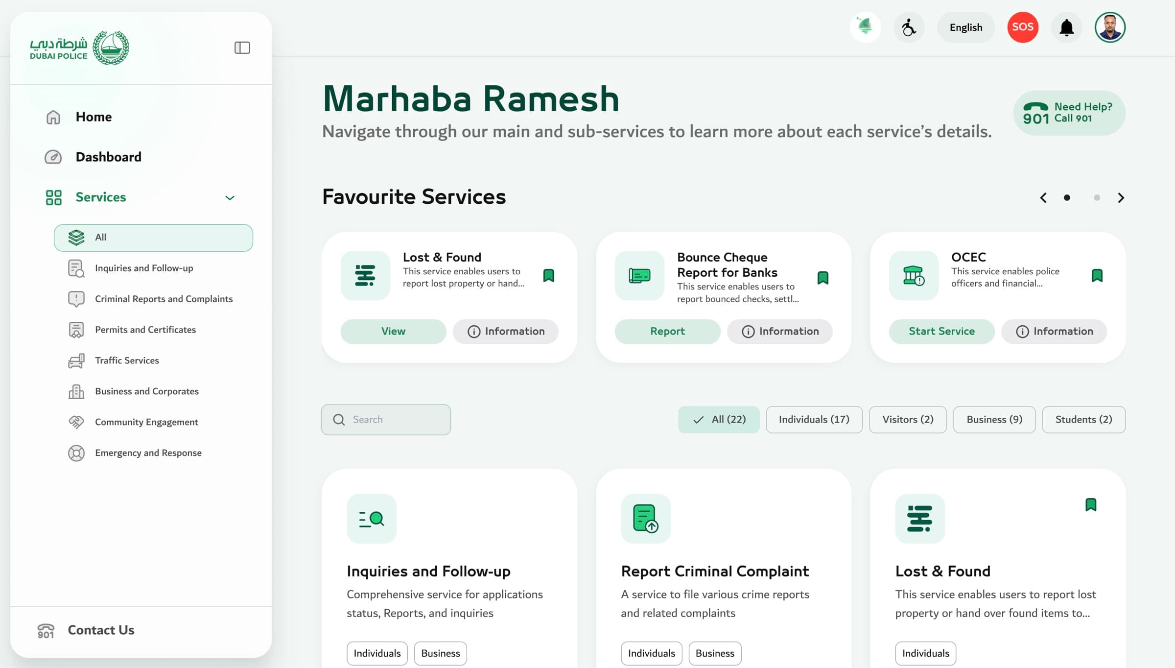
Service Portal
/app/servicesPay · Request · Report
Now the operating standard for every Dubai Police digital product.
04
Flagship craftBilingual by default.Beyond text-flip.
- 01Mirrored - not flipped
- 02Type pairing across scripts
- 03Numerals follow context
05
The solutionWhat we shipped.
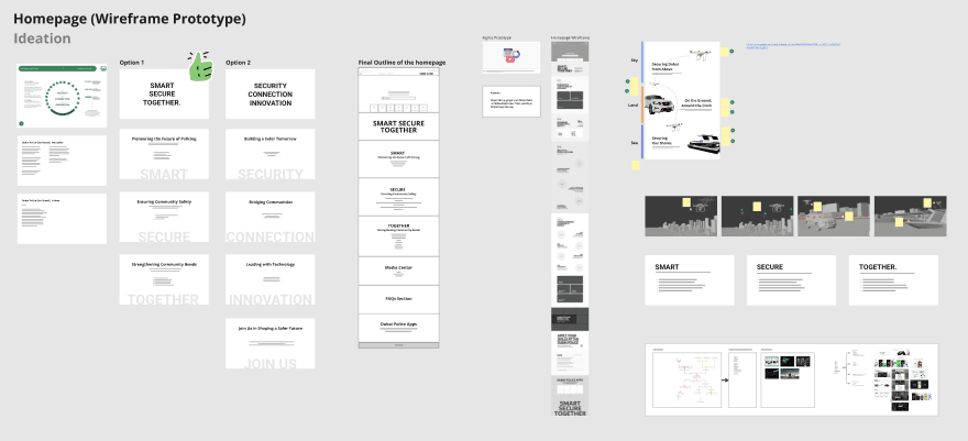
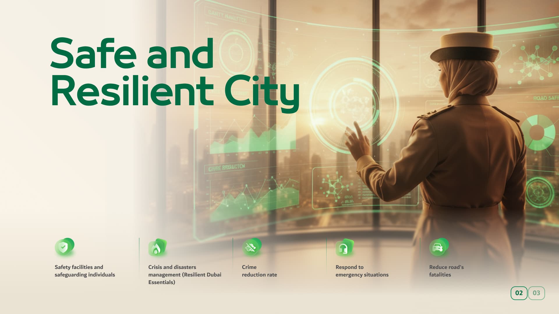
Smart pillar
Surveillance + aerial units
Secure pillar
Patrol · marine · school
Together pillar
5 Smart Police Station types
Customer Centers
Geolocation grid + map toggle
Media Hub
Anchor nav + immersive viewer
Open Data
Live crime + traffic dashboards
06
Outcome · 3 months post-launchThe numbers moved.
- BOUNCE−40%
Homepage bounce
- TASK SUCCESS+115%
Service portal task completion
- DEFLECTION−22%
Call-centre volume
* Indicative - pending publication of post-launch dashboard.
07
ReflectionIn a multi-stakeholder government context, defensible user-backed evidence outweighs eloquent opinion every time.
A 90-minute card-sort method gave me cover to push the unpopular two-part split through.
- Card-sort matrix
- IA tree
- Citizen journey map
- Component library
Next case study
02 · DUBAI POLICE